Passata is being rewritten at
the moment so the information in this page is out of date. I’ll be publishing a
new article as soon as it’s ready.
Passata design and features #
The pomodoro technique is a time management technique. I used it in the past and I plan to use it in the coming months, as it works well for me when I work alone. I don’t really need an application for it, but since I started my journey with React, I decided that building an application for the pomodoro technique would be a good playground. Having the pomodoro in my hands, I “processed” it and called my application passata. I guess my passion for cooking played its role here.
Here is a list of features I wanted to work on:
- Basic 25-minute timer for a pomodoro and a 5-minute timer for breaks. I don’t need custom times.
- I want to start a pomodoro by selecting a category (“development”, “email”, “writing” and so on) and then take notes while the pomodoro is running.
- I like graphs, so I want to plot the amount of completed pomodoro and void pomodoro (that’s how you call a pomodoro when you interrupt it before it finishes). Ideally the information is presented by category and by the following timeframes: “today”, “this/last week” and “custom”.
With those requirements in mind, I did some pencil and paper design and ended up with three screens:
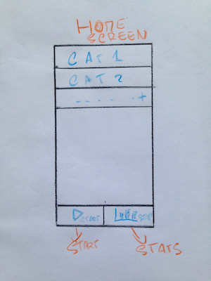
Home screen #
The home screen presents available categories. I can start a new pomodoro and access my stats.
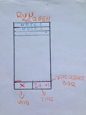
Run screen #
The run screen is shown when a pomodoro is running. I can take notes and check the progress of the running pomodoro.
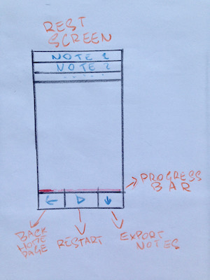
Rest screen #
The rest screen is similar to the run screen but shown after pomodoro completion. I can read and export my notes, I can start a new pomodoro or get back to the home screen.
I deliberately ignored the graphs view so I could focus on a first working version of the application.
A small detour in the webpack world #
As soon as I started working on the layout of the application, the size of the
bundle started bothering me. I was sure it did not need to be 5mb and I
decided to look into it. After all, my journey is a slow learning exercise, so I
can make a detour from time to time.
Webpack documentation has a guide about code
splitting. I assumed it was what
I needed and read the entire guide. I realised I had to understand how this
chunkhash thing worked as I saw it in many examples. I guessed it was about
caching, so I read that part of the documentation too. And this was the first
time I felt confused about webpack. I had (and still have as I’m writing about
it) doubts that I couldn’t solve by reading the documentation. I did not
understand how to use chunkhash from my static public/index.html. I read
about manifest files and I started feeling I was digging too deep of a hole. I
decided to focus on css splitting first which I did
here.
I read the caching guide one more time and the context became clearer to me. I decided to do a coding session about deploying the application to production later. Setting up an efficient production build is probably complicated enough to take up the space of an entire article.
First experience with props and state #
I tried to think about the application in terms of React components. With the help of a few video tutorials and the official documentation , I came up with the following plan:
- One component holds the current status of the entire application. Using state seemed to me a perfect way to deal with “home”, “run”, and “rest” pomodoro screens.
- All the other components have a page prop based on the state, so they can re-render themselves accordingly with the current state of the main component.
As soon as I started playing around with the layout, I ran into an issue with
semantic-ui React components. I had
to install babel-plugin-transform-class-properties so I could use class
properties syntax for React components. I couldn’t find any reference to this
plugin in semantic-ui docs; it was probably just my ignorance. I installed the
plugin in this commit.
The developer experience felt nice: every time I got something wrong, the error
messages were helpful. I was particularly impressed when it came to component
props. Only when I read Typechecking With
PropTypes
in the official React documentation did I understand why the experience was so
nice. PropTypes are considered an advanced feature, so you may not run into it
for a while. But it does not matter: you benefit from it every time you work
with a React library that uses the feature. I honestly don’t know if it’s common
practise to use PropTypes as I’m new to the community, but I’m sure it should
be.
While finishing up the first version of the layout, I ran into a strange semantic-ui bug and opened an issue. It turns out the bug was a duplicate. I wrote one of those “temporary workarounds” we make jokes about in the industry, which fixed the problem at the time.
The code of the first
version of the application
was simple enough. I believe simple solutions are not easy to reach and, since
I’m a complete beginner, I couldn’t complain much. I used a switch statement
to handle the conditional rendering of content, and somehow it felt a bit
strange. I’m not even sure why. I ran into 10 React
mini-patterns
and I was delighted to read there was one called “the switching component” for
my use case. I decided to get back to it once my components would look too messy
inside a switch statement. I always try to resist abstractions as much as I
can. It pays off most of the time.
At that point, I thought I understood the basics of React state and props.
However, I knew then as well as I know now that the “use state” vs “use props”
dilemma will stick with me for a while. The React semantic-ui
documentation for the Menu
component helped me realise I could simplify the menu using arrays of props
instead of writing each Menu.Item by hand in the JSX code. That’s a nice and
friendly API: it offers you several possibilities without being intrusive. I’m
not sure it’s just semantic-ui React or a common library pattern; I hope it’s a
widespread way of rendering children components. In the end, I didn’t change it.
I sticked to my favourite programming principle once again: “Make it work, make
it right, make it fast”.
It served me better than any other principle in my career.
As I started feeling comfortable with the basics of React components and semantic-ui, adding the content panel was easy and quick. I was even satisfied with the appearance of the application despite my terrible frontend skills. I had a doubt about the way I was rendering the content panel, but decided it was good enough for the time being.
Make the timer tick #
It was time to introduce a timer for the running and resting pomodoro. I did some research about writing an accurate timer in JavaScript. I knew from past experience that just summing up elapsed seconds via setTimeout is not accurate. I found a great explanation of the problem with a couple of good working examples. I merged a draft of the timer based on the answer I found in this pull request.
I called the pull request “Draft of the timer” because I knew I wanted to extract it to its own class. Here are the next steps:
- Introduce a Timer class so I get to play with ES6 features a bit more.
- Add unit tests for the timer with jest.
- Annotate all the code with flow types.
I think that’s enough for the next article and I can’t wait to get started.
Thank you for reading me and stay tuned for the next article!