This project has been archived.
Today I’m open-sourcing deloominator: a data visualization tool for SQL users.
You write SQL queries into a small web UI, you run your queries and
deloominator automatically renders a chart if it can detect an appropriate
visualization. Soon enough, you will be able to save your visualizations, create
dashboards and reports.
In this article, I cover why I’m building deloominator, what’s the current
status of the project and what’s coming next.
Why? #
As a developer, I’ve always liked data visualization. I like looking at graphs to spot problems in our systems. I like guessing how a graph would look like if I knew the system’s behavior. As I got closer and closer to product management, my understanding of data visualization changed: I understood why I personally like graphs and why they’re so important for a company. Data visualizations can express more than raw data sets. You look at a graph and you can extract insights from what you see, and these insights can change the course of a company. Data visualization is a powerful and much needed discipline, even more so now that storing data is cheaper than ever.
Let me share a trivial example with you to better explain why I’m so fascinated
by data visualization. Let’s say I have a users table in my database that
stores customers information and I want to get a better understanding of how
we’re doing in terms of acquisitions. I can write a SQL query like this:
SELECT country, to_chr(signup_date, 'yyyy-mm') period, count(*) acquisitions
FROM users
GROUP BY 1, 2
ORDER BY 1
The result may look like this:
| country | period | acquisitions |
|---|---|---|
| DE | 2016-06 | 195 |
| DE | 2016-07 | 181 |
| DE | 2016-08 | 173 |
| DE | 2016-09 | 190 |
| DE | 2016-10 | 153 |
| DE | 2016-11 | 156 |
| DE | 2016-12 | 152 |
| DE | 2017-01 | 179 |
| IT | 2016-06 | 0 |
| IT | 2016-07 | 79 |
| IT | 2016-08 | 106 |
| IT | 2016-09 | 113 |
| IT | 2016-10 | 123 |
| IT | 2016-11 | 113 |
| IT | 2016-12 | 155 |
| IT | 2017-01 | 179 |
| NL | 2016-06 | 100 |
| NL | 2016-07 | 90 |
| NL | 2016-08 | 110 |
| NL | 2016-09 | 102 |
| NL | 2016-10 | 122 |
| NL | 2016-11 | 164 |
| NL | 2016-12 | 195 |
| NL | 2017-01 | 177 |
From a business perspective, there’s hardly anything I can understand looking at the raw data set. The only thing I can figure out is that we had no acquisitions in Italy for the month of June 2016. Maybe we launched in June there, I don’t remember exactly and I should check that. But I surely can’t say at first glance in which market we acquired more customers or if there’s any trend (positive or negative) I should be aware of. Now, let’s try to visualize this small (and purposely trivial) data set with graphs. Let’s start with aggregating the acquisitions by country:
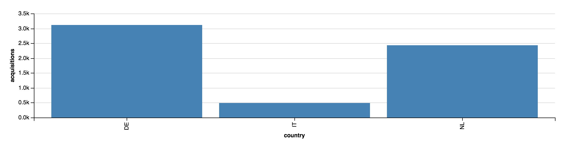
The insight is obvious: Germany is the country where we acquired more customers, Netherlands is doing good and Italy is not quite there yet. An interesting side note: just a few weeks ago I would have presented the same information as a pie chart. I’ve used pie charts for a long time in my presentations. But I learned that [they don’t really work], so I’m always defaulting to bar charts now. It’s the beauty of the building process: you learn something new everyday.
The other question I had was about trends. Trends tell you a lot about a business:
- you can use them to do impact analysis
- Spotting trends can generate great questions and subsequent research when you can’t explain why there’s such a trend
- You can spot the seasonality of your data. That’s important so you can plan scaling
For this small data set I can use a multi line chart:
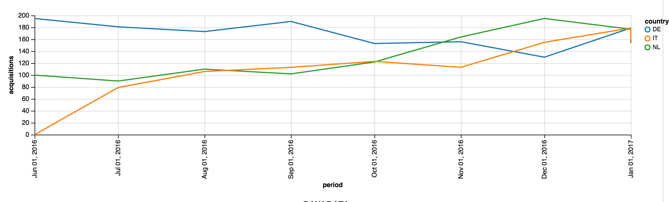
In this case, the insight is more subtle: Germany (the country in which we acquired more customers) is the only country with a negative trend over the Christmas holidays. This needs further investigation. The point though is that it wasn’t so easy to spot the negative Christmas trend in the raw data set, even with such a small data set.
In these examples, I used the same small data set twice and just presented the information in a different way. That’s the idea I find so powerful about data visualization, especially if you combine it with the fact that data alone isn’t relevant in business. It’s the underlying information that matters. I can’t emphasize enough the difference between data and information: I had data when I wrote the SQL query, I got information only when I transformed it into graphs.
Simple SQL queries like the one I presented here can lead to important business discussions. Which, in turn, can change the future of a company. Transforming the data set of a simple SQL query into a chart helped me understand there was something wrong with our acquisition efforts during Christmas in Germany. Maybe there’s a bug in the localized code, maybe the marketing campaign was set up wrongly. Once again, without the graph I wouldn’t know we had a problem.
Over the course of my career, I observed an interesting phenomenon related to
how companies treat and use their own data. Developers are obviously the
closest to the data: they know how the applications store data, because they
write the code that does the writes and the reads. Good product managers have
a good understanding of how data relates to features. In most companies, folks
outside the product development departments don’t have a good sense of how to
relate business questions to their own data. Generally, as a company grows and
scales, additional layers are added between the developers that know how to
extract data and the business questions that need answers. As we’re talking
about human beings collaborating, we’re talking about communication. And
communication is hard even if there are only two people speaking to each other
(sometimes I find it hard to talk even to myself, but that’s a different
story). As you add layers between your developers and your business questions
(the source of the questions isn’t relevant in this context), your
communication overhead plays against the effort of working towards a common
goal. The key is “common”: we can have a common goal only if we’re talking
about the same thing. And we’re talking about the same thing only if we use
and share the same data. As most applications rely on SQL databases, the data
coming straight from a DB is the “ultimate source of truth”. I have often seen
the same metric slightly change meaning from one department to another, and I
struggled to accept that the status quo of a growing company is that “we kind
of understand what metric X is but we’re not so sure we’re gathering the right
data”. While I think no tool can fix a communication problem, tooling can help
facilitate the necessary conversation and force the right constraints for the
process to work. That is my long term vision for deloominator: I like to
think of it as a communication tool, a data visualization tool that can help
you bring together people that normally work far from each other. This will
help an entire organization rely on the same data sets, work with them and
and transform them into information. A simple but effective tool can help on
different levels:
- Developers have a better understanding of why metric X is relevant.
- Product managers can map (and validate if they speak some SQL) features against KPIs. That makes it easier for everyone to ensure there’s an accurate impact analysis process in place.
- People that don’t speak SQL can rely on more accurate data. No more calculations with giant spreadsheets are needed if changing a report or a data visualization doesn’t take a month (or two sprints, but you shouldn’t do sprints. Once again, that’s a different story).
As everyone needs data, people from different departments use whatever source they can: CSV exports based on the actual data, handmade charts in Excel and so on. That works just fine in the short term and I suspect that’s why it’s so common. But this brings at least two problems in the long run:
- People start using reports in a non intended way. They create spreadsheets with fancy calculations over your reports. This effectively means that part of your public API is that CSV export you haven’t touch in months.
- Changing these reports isn’t as fast as people would like. They require developers’ work, and product managers like to build features that have a direct impact on customers rather than changing a column in a report.
A tool like deloominator can shorten the feedback loop, at least that’s one
of the goals. If all you need to do is writing a SQL query, transforming data
into information (therefore providing insights) has a much lower cost than
building a feature. And a faster execution of the single most important
process of any company gets me excited. The main idea behind deloominator
isn’t new: there’s a variety of tools out there that solve a similar problem
following a similar approach. So I’m not inventing anything and I don’t intend
to take credit for that. But all these tools approach the problem in a way
that doesn’t satisfy me, in one way or the other. That is what ultimately
convinced me to start working on this project.
I want to build a communication tool that makes it as easy as possible for product development folks to share visualizations with the rest of their company.
What’s the current status? #
deloominator is in a very early alpha stage at the moment:
- I’ve just open sourced it. That means I’m the only person that has worked on it so far. That can’t mean good quality.
- It’s not comparable to any other available solution yet, so I can’t advice using it on a real project. It was a conscious decision to open source it at this stage, so that I can build features using some feedback. I hope that having a few charts to share and the basic infrastructure of the project is enough to get people excited about it. Let’s see.
The project has a public
roadmap which is
detailed enough for me: it probably means it’s not good enough for anyone else
yet. Same level of detail for the features: I wrote the documentation for what
deloominator already does, but I left out better specifications for the
coming features on purpose. After all, a product roadmap and its specs are
living documents people use to communicate and visualize the direction of a
product. If I’m doing this alone, there’s very little point in having a great
roadmap. The project has
milestones
too, they’re nothing more than a series of timely ordered batches of features
in the current roadmap.
What’s next? #
There’s a lot to do, of course. Even though it is still a long way to go to
version 1.0, I can’t wait to get there so that people can use it in
production. As for the immediate future, I will work on the milestones one
after the other, and I hope I can release 1.0 as soon as possible.
For those of you that want to learn more about the internals of the project, I think the best entry points are here (in no particular order):
- the developer’s manual
- The issues with the labels gardening and good first patch
- the Makefile
I have planned a series of articles about the how and why of the technical choices, I think there’s a lot to say, even though the project is still small.
Please feel free to approach me with any questions about deloominator:
email or
twitter are the best channels!